OpenGov
Rebuilding public trust in open data
Why is it so difficult to see how our government spends our money? That’s the question that OpenGov was trying to solve. After all, what could be more important than transparency to ensure that the precious tax dollars collected by the state are being used with a scrap of responsibility?
For far too long, government data has been locked away in ancient IT systems. And when the data is released, it still appears inaccessible. Merely making those difficult-to-decipher 500-page budget PDFs and 40,000-row Excel spreadsheets available for download is useful to almost no one.
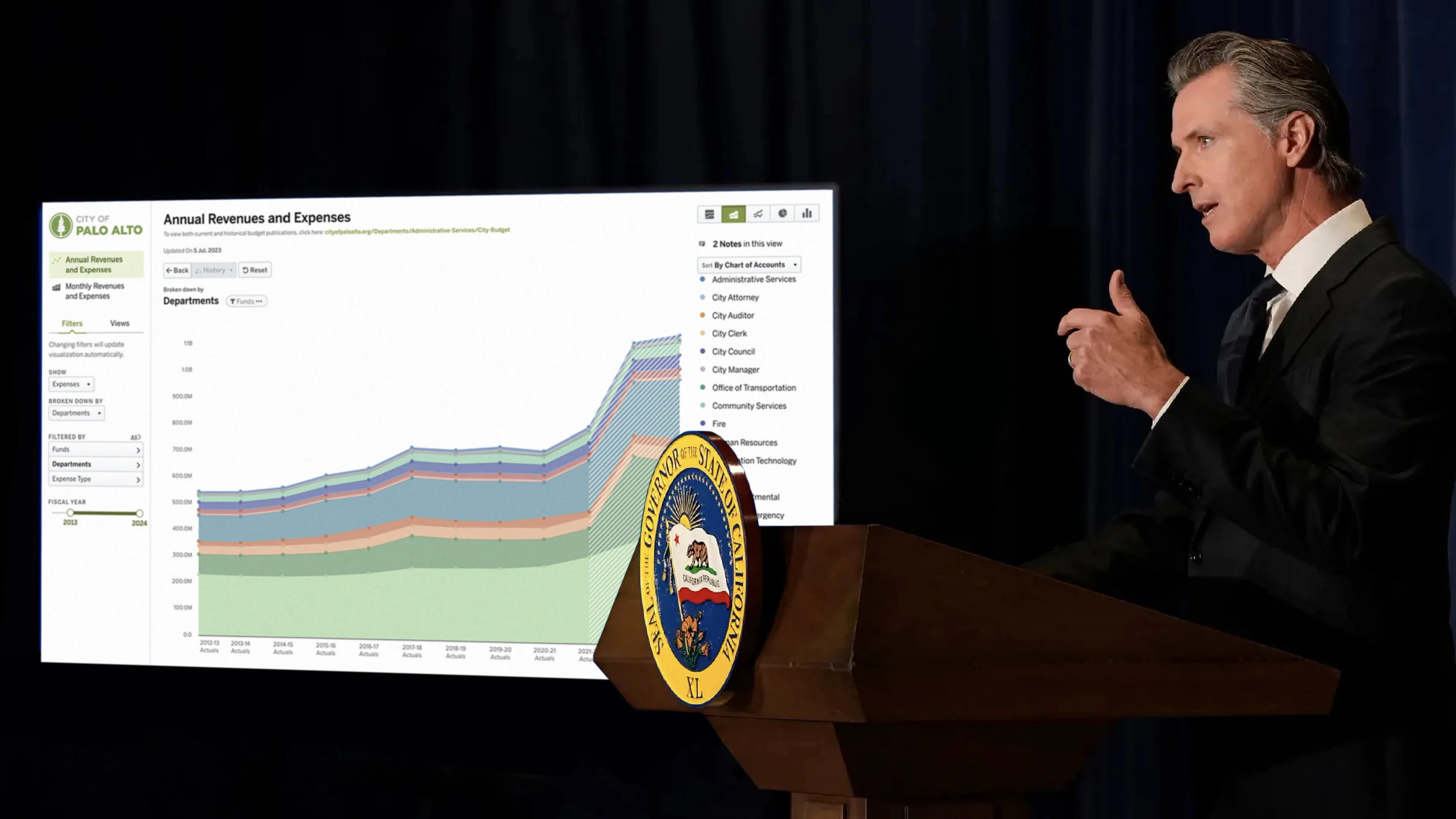
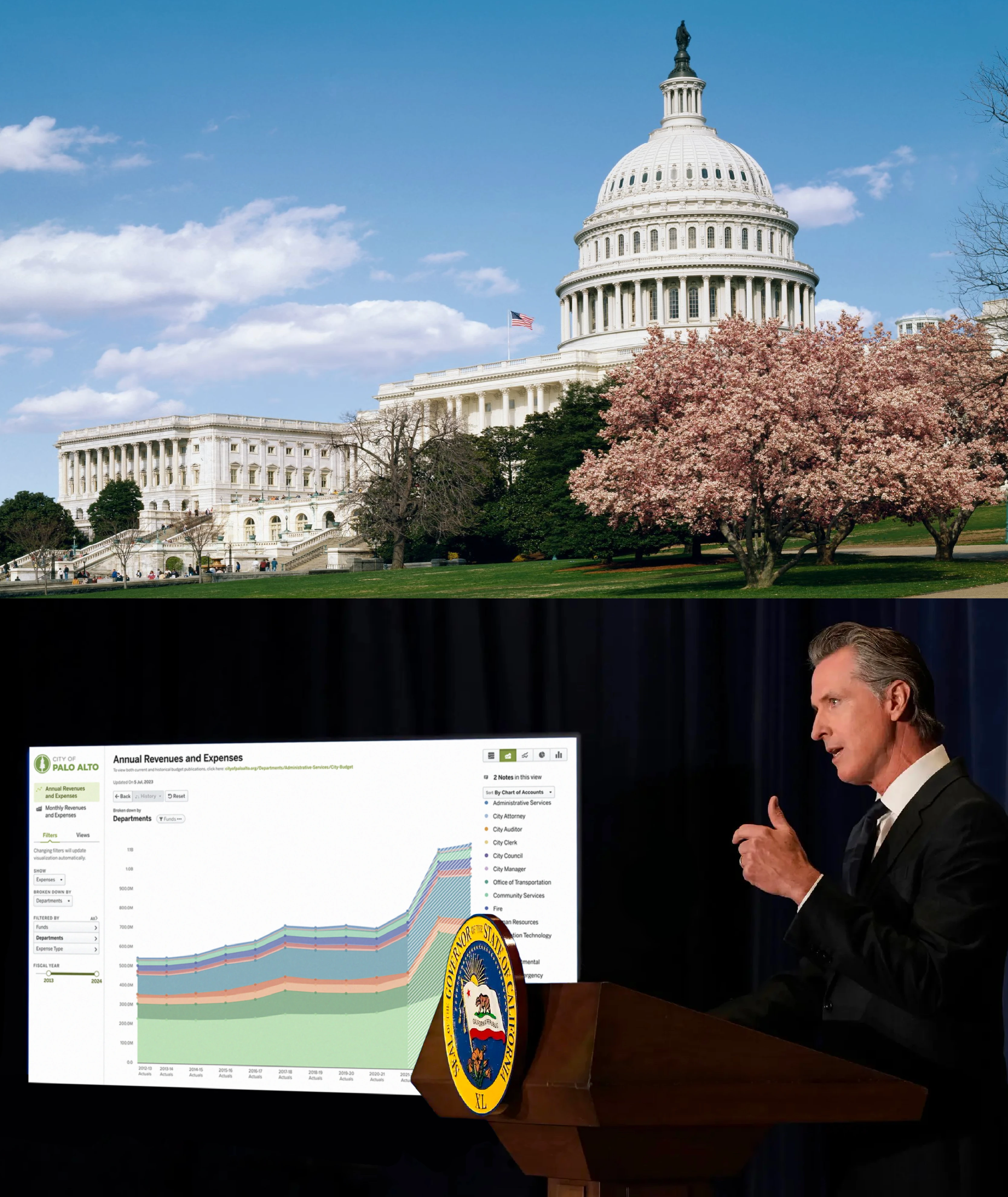
With the goal of making it easier for citizens to find and understand how their tax money is being spent, we created tools that visualize, analyze, and share government data, allowing anyone to not only track government spending but also actually understand it.
As the first employee and lead designer at OpenGov, tons of early prototypes were developed to discover better ways to display the government’s massive financial data. As we signed more pilot customers, we received a stream of feedback, which assisted us in identifying several significant issues.
We talked to key officials of almost every city in the Bay Area, interviewed several journalists, non-profits, and engaged citizens, and evaluated the feature requests and market reports to gain a better understanding of the problem, and key themes began to emerge, such as confusing navigation and filter tools that are difficult to discover. Several usability tests we conducted remotely confirmed the same core issues as well.


One of the most important findings was that the aesthetic was nice but intimidating. When we asked people to describe their impressions of the product, we often heard remarks about how sleek it felt, which contradicted the product’s promises of evoking sentiments of transparency and trustworthy.
As a result, we decided to make a significant change and after months of more iterations and usability testing, the ideas started to flow. Slowing down long enough to capture each new idea proved our greatest challenge.
With the improved design, we sat down with a number of pilot customers including representatives from the finance department and the mayor’s office, and let them experience the barely functional prototypes, and the feedback was overwhelmingly positive. We then tested the new design with a few additional selected beta customers to further validate the feedback. I recall walking into each user interview with the concern that they might prefer the old design. Thankfully, the customers approved of our improvements. We hunkered down and spent the following two months producing the final product with that confirmation in hand.


I also made accessibility a top priority from the start. Not only do we need to be Section 508 compliant because we engage with government institutions, but I genuinely believe that data should be available to as many people as possible. I conducted extensive research on accessibility and examined countless best practices to help develop the core palette of 40 colors for our interface.
The colors were then divided into smaller groups for different kinds of visualizations (with the hope that we would never need to use all 40 colors). We then made appropriate use of alt tags and placed descriptive titles directly on graphs whenever possible to further enhance usability. We later on released our design guidelines and research to the public as open source for the public to use for data visualization projects.
Now with everything in place, we are ready to onboard the massive amount of new customers (almost a hundred local governments at the time). The color theming system then enabled us to quickly automate the personalization for a customer's overall user interface and controls, duotone icons, and data visualization based on their brand colors, to create a interface that seems unified yet feel distinctive from one another.


We spent three weeks after the development was completed performing detailed usability testing and customer interviews, and with several rapid iterations, the new version resulted in a five-fold increase in sales in the following year, and our sales picked up significantly.
Within the first year, we had analyzing $50B worth of government expenditure throughout the country, and thousands of engaged citizens interact with the site on a daily basis, connecting to their cities' financials and performance with this new medium of open data.
in 2024, OpenGov has secured a majority investment valuing the company at $1.8 billion. This allows OpenGov to make long-term strategic decisions that will benefit 2,000 cities and counting in all 50 states for decades to come for their budgeting, accounting, procurement, asset management, and permitting to operate more efficiently, adapt to change, and strengthen public trust.
One in Three Americans now benefit from OpenGov software.


Research & Design
JJ Moi / Zach Johnston / Inge Fryklund / Jersy Huang / Andrew Liebchen
Development
Nate Levine / Krishna Rajendragon / Heath Emerson / Chris Chiu
Further Readings
→ $1.8 billion deal for government software provider – Wall Street Journal
→ On the founding and mission of OpenGov
→ The startup analyzing $50B in spending
→ OpenGov raises $51M to boost its cloud-based IT services for government and civic organizations – TechCrunch
→ A singularly startup that might make a difference – Vox